The "infinity shield", according the brand website "symbolizes that the SOA is continually evolving to produce forward-thinking education and professional development opportunities. The shield represents a strong, fortified foundation, bound by standards and principles that advance your interests."
Wikipedia calls it an "impossible object".
So, quite simply, the essence of an actuary is represented by an infinite impossibility. Fitting, as much of the public still has no idea what actuaries do and some still doubt that actuaries actually exist. Why not be represented by a geometric symbol from the realm of mythology and legend?
Sources leaked some alternative designs that almost made the cut:
The Introversion Vortex
Representing the vacuum of human contact that surrounds many actuaries.
The Eternal Bowtie
Nothing would capture the sophisticated nerdiness of the actuary like the lemniscate surrounded by a bow tie,
The Superiority Complex
Because we all now that actuaries are smarter than you, are paid better, and know when you are going to die. Image not shown. Described as a round-topped cylinder protruding from the middle of two adjacent spheres, the logo seemed a bit too phallic.
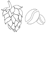
Hops and Beans
Where would actuaries be without beer and coffee -the fundamental ingredients of actuarial judgement?


No comments:
Post a Comment